It’s hard enough to get people to visit your site in the first place. Don’t make these mistakes and alienate visitors once they arrive. If you do, they’re unlikely to come back.
1. Mobile Unfriendly Design
When I help clients set up a Wordpress site and we’re choosing a theme, I always recommend using a responsive one. Responsive sites automatically resize the page depending on the size of the window.
If you’re viewing this site on a desktop, make the browser window smaller and watch what happens to the content. It automatically adjusts as the screen gets smaller. That is a good thing.
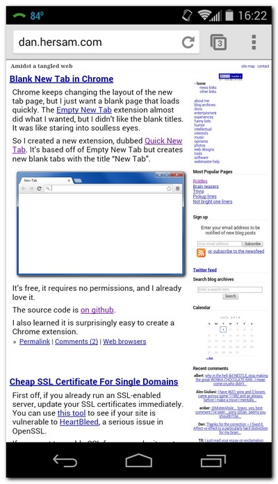
Here’s a visual to give you a better idea of what I’m describing. This is what my personal site looks like on my phone. It doesn’t use a responsive design. As a result, the phone’s browser shrinks everything down, making it hard to read and click on links. I need to update the design, but hey, it served as an example for you :)
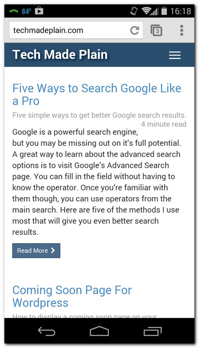
Now look at how this site (TechMadePlain.com) looks on my phone. It uses a responsive design. Notice how much easier it is to read and how the menu collapses. This puts the content front and center and the text is large enough to read easily.
All new sites should use responsive designs. Otherwise you’re making it hard for users to read your content. Google has also said they’re using the mobile-friendliness of a site as a ranking factor.
Which of the two sites above would you rather read on your phone?
2. Autoplaying Music
Playing music automatically seems like fun at first. But try visiting the site every day for a month and you’ll be singing a different tune. Plus, what if I’m already listening to music? (like I am right now - Enya’s Tempus Vernum). Playing your music on top of mine is not appreciated.
If you feel strongly about having music autoplay on your site, at the very least, make it easy to turn off. Just know that I (and many others) will not appreciate it and will immediately look for the mute or stop button.
3. On Screen Pop-ups
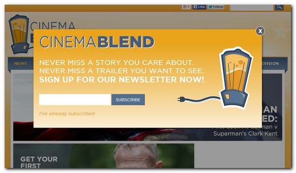
When I see one of these pop up before I even have a chance to read anything, I will usually leave. The problem is you haven’t built any sort of relationship with the visitor. You haven’t provided any value, but you’re asking them to hand over their personal information.
For all they know you could be the mad spammer. You might send a dozen emails a day and never let them unsubscribe. And what sort of message does it send if you’re willing to sacrifice the user experience to get a subscriber? How does it make the visitor feel?
Pushing for an email address without letting the user read your site is like proposing as soon as your date opens the door on the first date. It’s pushy and inappropriate.
The sad thing is this method is effective at getting subscribers. I’ve even heard people say they hate doing it, but it adds more emails to their list. That’s not the way I want to start a relationship.
My guess is the subscribers you get using this method will stick with you as long as Jana Kramer’s 3 husbands. (Hint: Not long)
4. Too Many Ads
This should be obvious. Having more ads than content is a real turn off. I understand you need to earn an income, but you also need to strike a balance.
5. Excessively Large Images
There’s nothing wrong with having images and elements on your site. But your images should be the same resolution as they’re shown on the page, unless resizing makes the file size bigger. (It’s odd, but it happens regularly with the screenshots I use).
In short, you want the image’s file size as small as possible. Be sure to optimize your images too. I use PNGGauntlet for PNGs and RIOT for JPEGs. There are also online options available too.
All too often I visit sites that load extremely slowly because their images are ridiculously large. It’s like having to download a picture the size of your TV in order to see it shown the size of a postage stamp. Instead, upload the postage stamp image to begin with.
It’s a waste of bandwidth and the user’s time to load a full resolution image then make it appear small on the page. When you resize the actual image to the size you want it on the screen, your users will thank you. Especially mobile users with limited data plans.
Conclusion
The big takeaway here is to focus on the user’s experience. If you make your site quick to load, mobile-friendly, user friendly and silent, you’ll have happier users. And more importantly, they’ll come back.